awhile
Solo designed and built a native iOS meditation app in SwiftUI, solo. Live on the App Store. An personal project asking: what happens when you strip a meditation app down to the essentials?
Role
Design & Development
Timeline
2 Months
Company
Personal Project
The Problem with Meditation Apps
Calm and Headspace started simple. A timer, some guidance, maybe a few ambient sounds. Then they became content platforms. Celebrity narrators, sleep stories, daily reminders, workout classes. The thing that was supposed to help you slow down now competes for your attention the same way everything else does.
There are an almost infinite number of meditation apps on the store, but my experience was that you either got quality with the big, bloated apps, or chose a more minimalist app, but the quality wasn't there. I could not find the app I wanted, so I built it.
Designed by Subtraction
The visual design borrows heavily from Dieter Rams' work at Braun in the 1960s and 70s. Rams' principle was "less, but better." That felt like the right starting point for something meant to help you do less.
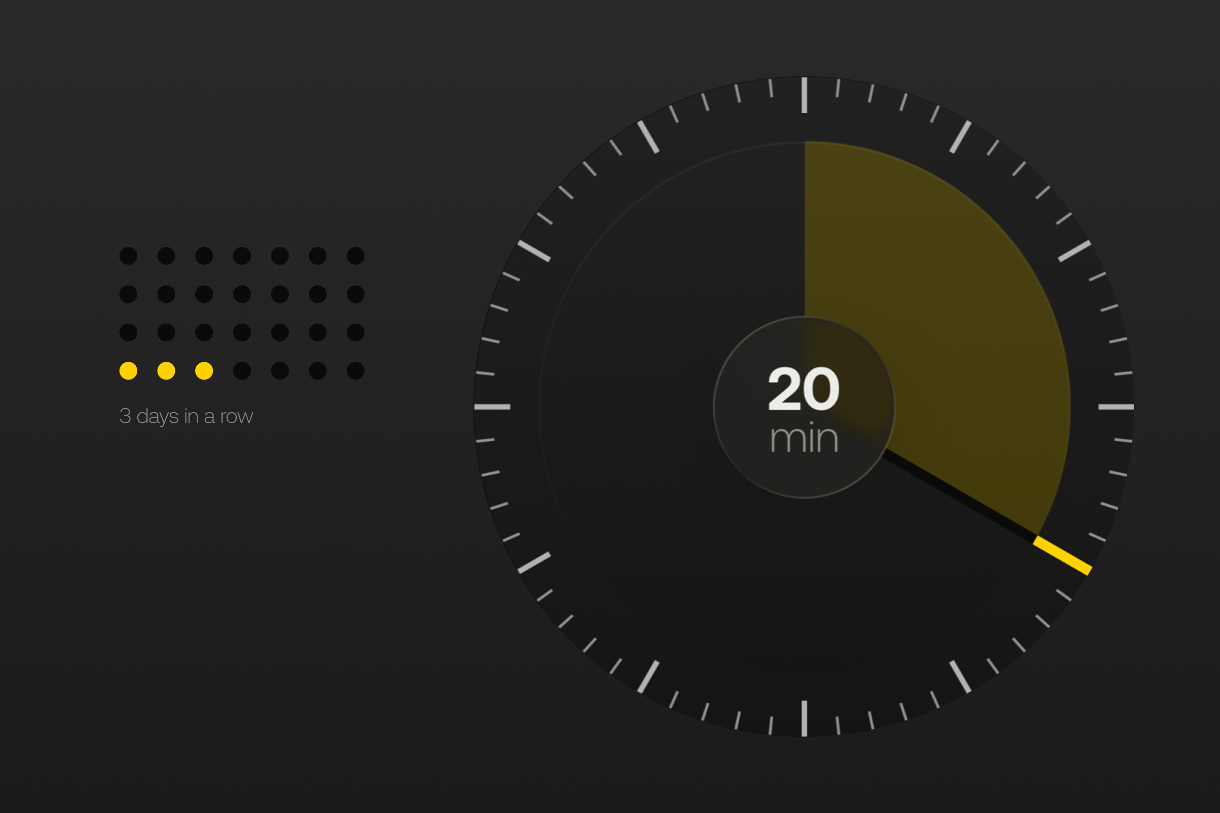
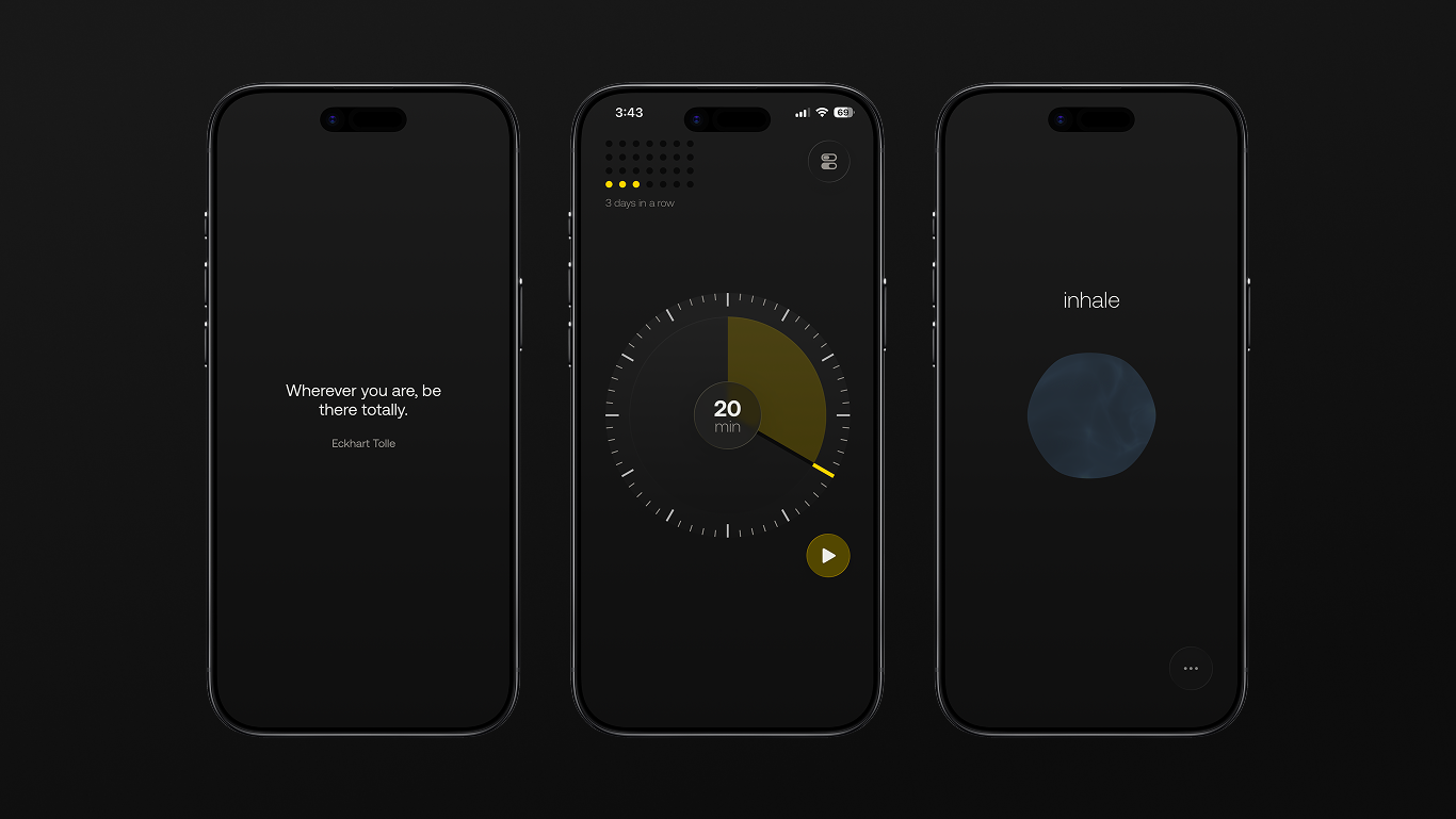
The timer is the whole interface. There's no onboarding flow, no account creation, no content library. You open the app and you're looking at a timer. Pick a duration, pick an ambient sound if you want one, and start.
Streaks A simple streak counter tracks consecutive days. It's the only piece of data the app surfaces. No charts, no minutes logged, no badges. Just "did you show up today."
Intentions Before and after each session, users are given an inspirational quote to help set the intention for the practice. And also given the option to share the quote with a friend.
The app is built natively in SwiftUI with CloudKit syncing streaks across devices. Native felt right here because the interaction is so minimal that every frame of animation and every haptic response matters.
What I learned
awhile is live on the App Store and still getting updates. Building it reinforced something I now apply to every product I work on: the most important design decisions are about what to leave out, not what to add.
Owning the full stack changes how you design. When you're responsible for implementing every interaction, you stop designing things that look good in Figma but feel wrong in motion. Every animation, every haptic, every transition was tested on device because there was no handoff step where details get lost.
Personal projects are a great design laboratory. awhile gave me a space to test ideas without compromise. The result is a product that reflects a single point of view, something that's difficult to achieve in collaborative work but valuable to have experienced.