PGA Tour Quality Shots
A PGA Tour partnership that turns amateur approach shots into shareable, Tour-benchmarked moments.
Role
Lead Designer (UX & UI)
Team
Design, Engineering, Product Management, PGA Tour
Timeline
3-4 Months
Company
Arccos Golf
The Opportunity
Arccos had the amateur data. The PGA Tour had the professional data. I designed the feature that connected them: a system that identifies when a recreational golfer hits an approach shot that meets Tour-level standards, packages it into a shareable card, and gives them a reason to tell everyone about it.
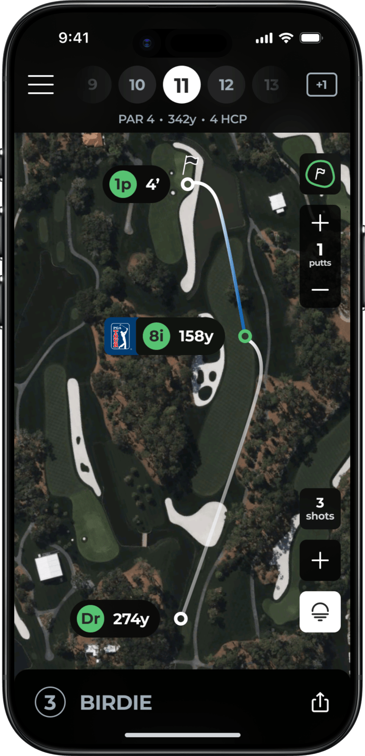
Arccos tracks every shot a golfer hits. The PGA Tour, through ShotLink, has data on every shot hit on Tour. The partnership idea was straightforward: compare amateur approach shots to the pros. Approaches are the most measurable, most relatable shot type. Everyone knows what it means to stick an iron close.
The goals stacked up. Give amateurs a real benchmark for their best shots. Give the PGA Tour a consumer touchpoint that puts their data in people's hands. And create shareable moments, shots worth posting, that drive engagement for both brands.
Designing Within the Lines
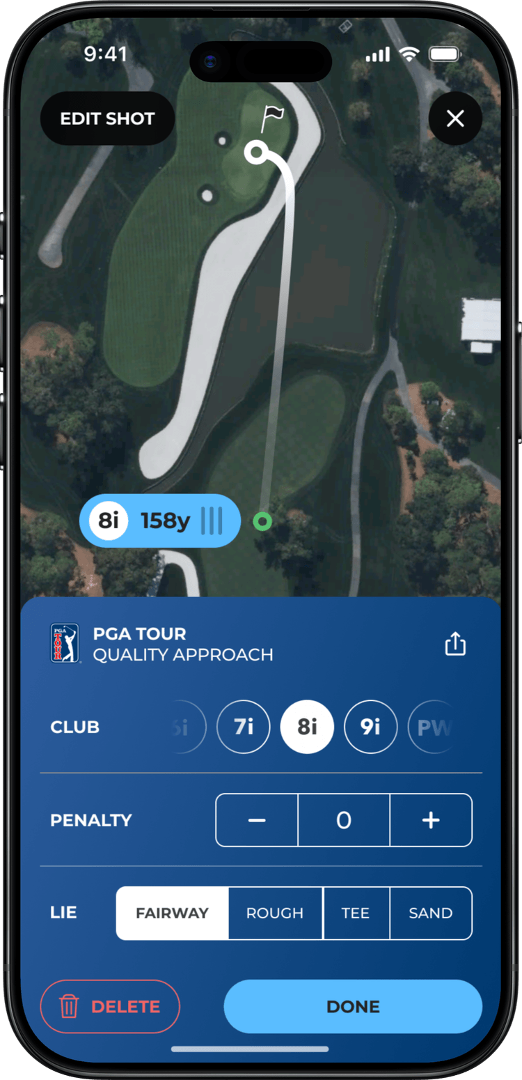
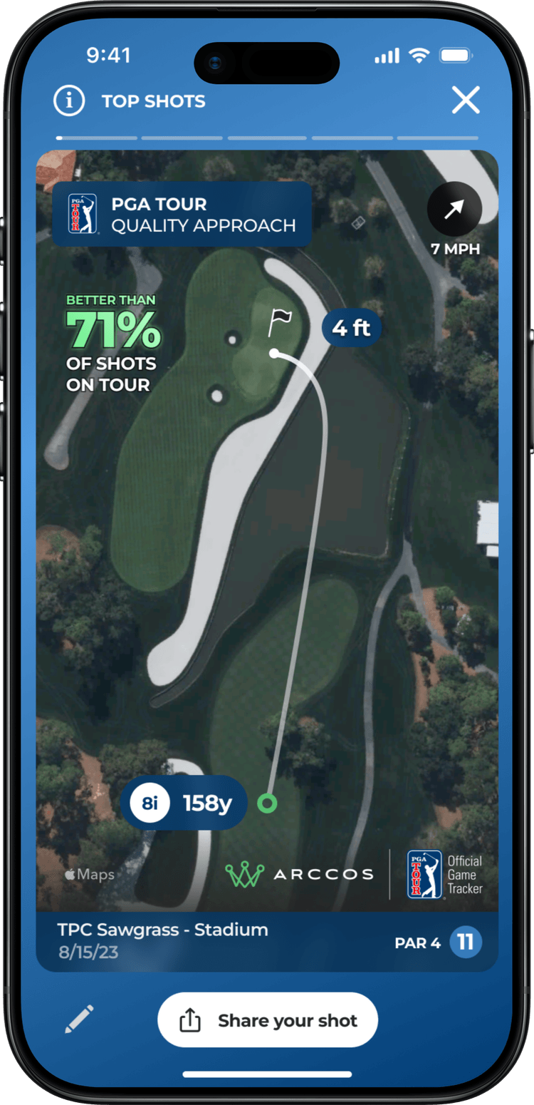
The PGA Tour had strict brand guidelines. The "PGA TOUR QUALITY APPROACH" badge, colors, and logo placement all went through their review process. Every screen that carried Tour branding needed approval.
The challenge was making the PGA Tour branding feel premium and integrated, not like a sponsor sticker slapped on top. It had to feel native to the Arccos experience while clearly communicating the partnership. Several early directions were rejected because they felt too promotional or broke the visual rhythm of the existing app. The version that landed used the Tour's color palette and badge mark in a way that elevated the content rather than competing with it.
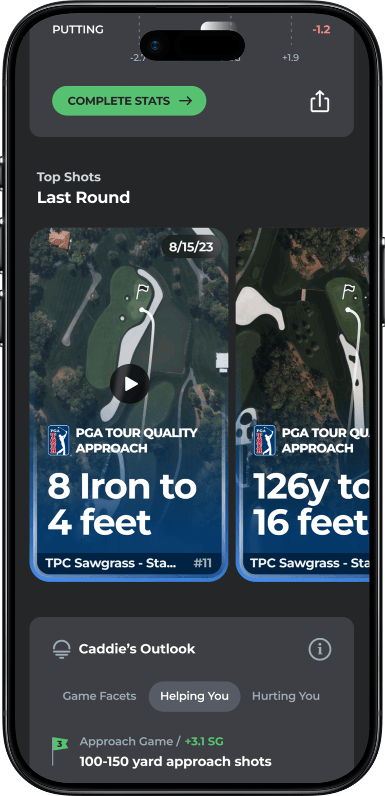
Surfacing Your Best
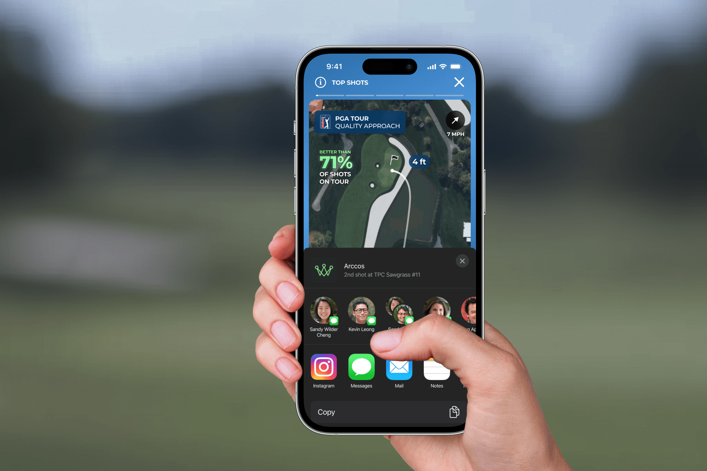
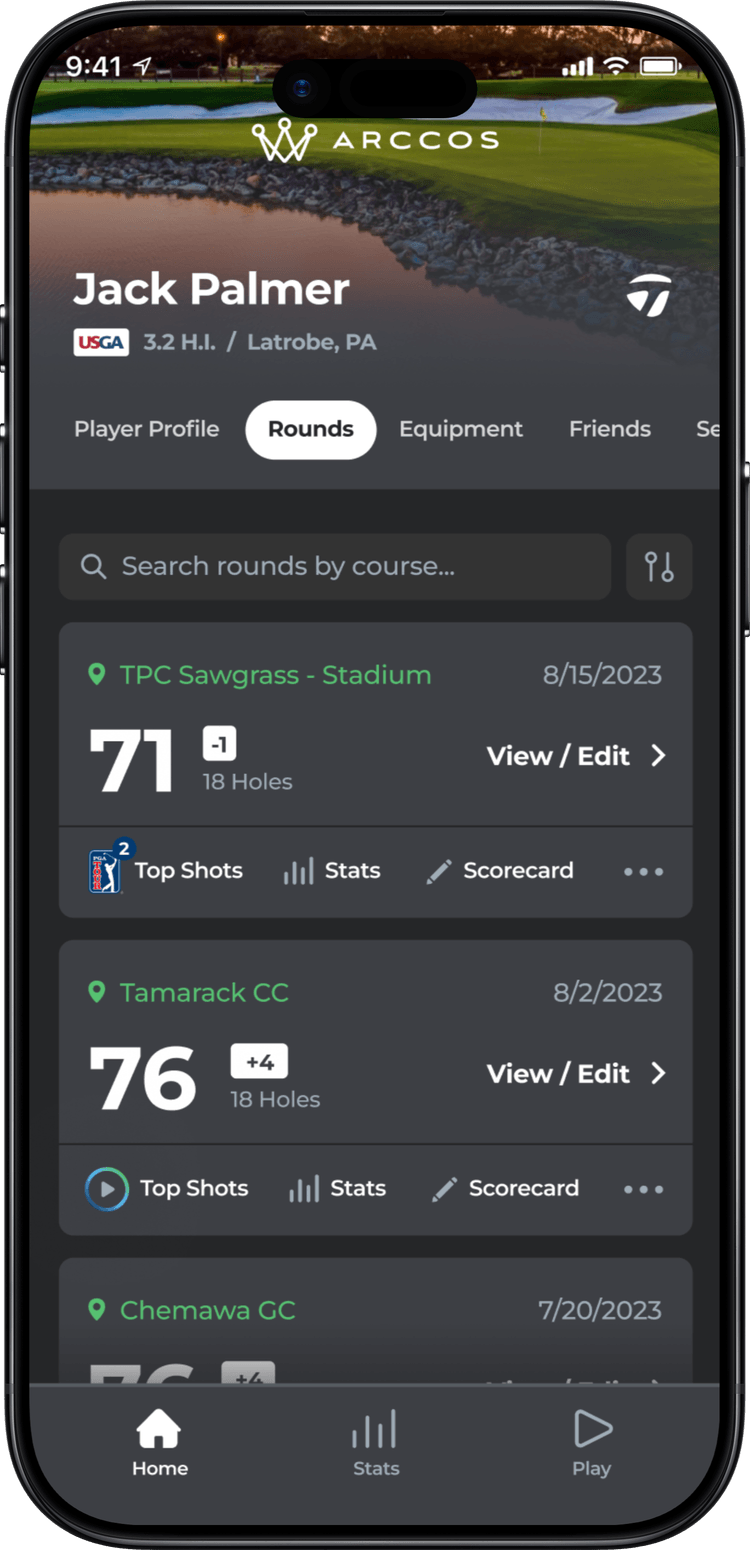
After a round, the system identifies approach shots that meet PGA Tour quality thresholds using ShotLink data. These get surfaced as "Top Shots" in the player's feed. No digging required. The best shots from your round are waiting for you.
The subtler design problem was translating raw ShotLink data into something that felt meaningful to an amateur. "Better than 71% of shots on Tour." That's immediately understandable. Club, distance, result, wind conditions: the context that makes a stat feel real instead of abstract. Every detail on the card had to earn its space.
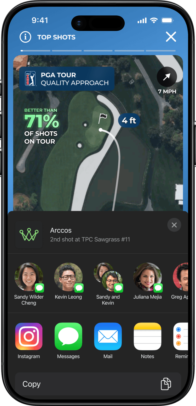
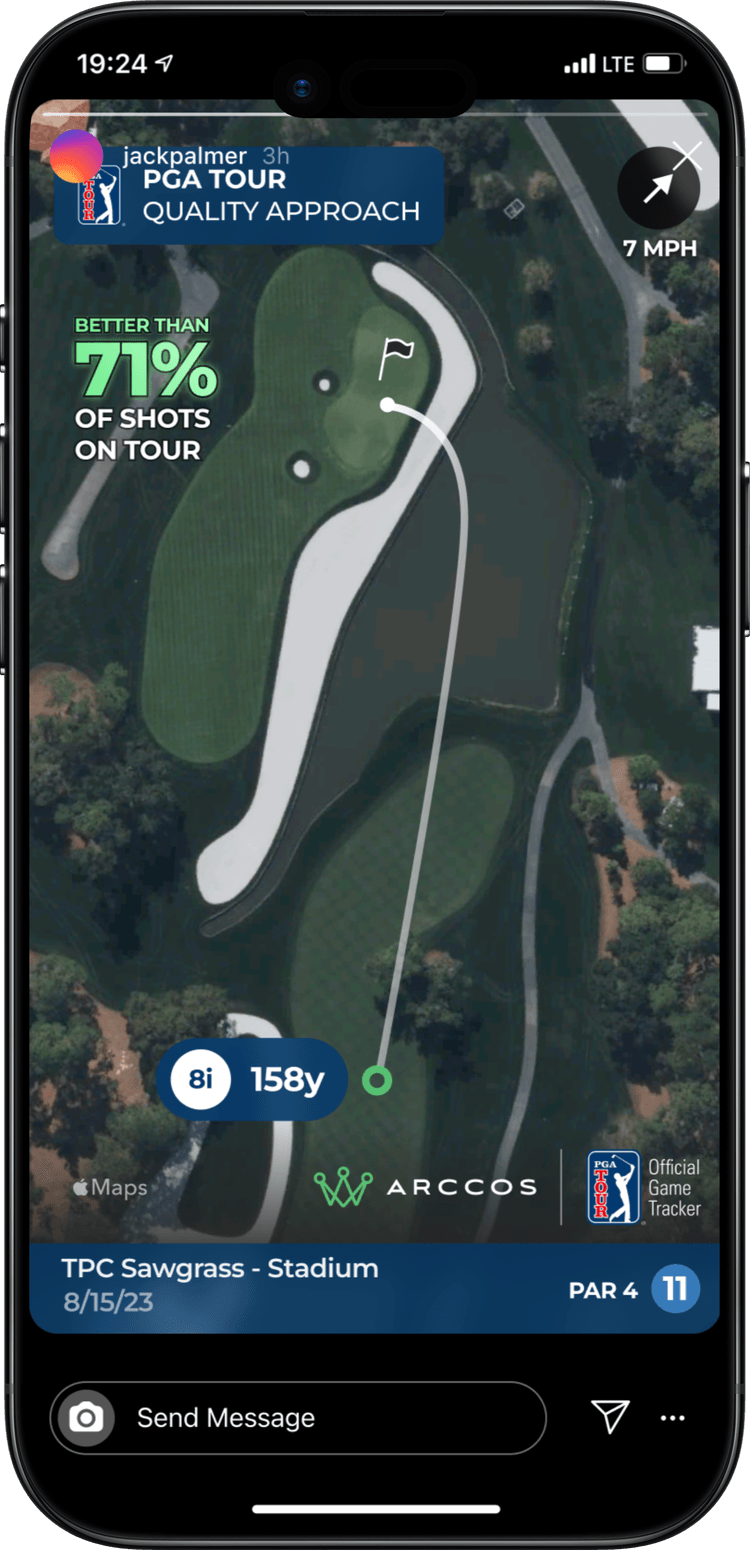
Built to Share
The share card had to look good everywhere: Instagram Stories, TikTok, iMessage, anywhere a golfer might post it. It needed to stand on its own. Someone who's never used Arccos should look at a shared quality shot and immediately understand what it means: this person hit a shot better than most pros.
Results
Quality Shots became one of Arccos's most-shared features. The share cards showed up consistently on Instagram and golf forums, giving the PGA Tour partnership organic visibility that neither brand had to pay for. The feature drove meaningful engagement: users who received a quality shot notification were significantly more likely to open the app and review their round data in full.
The partnership expanded after launch. The PGA Tour was pleased enough with the integration that it opened the door to additional data-sharing conversations, validating the approach of treating their brand as a co-equal part of the experience rather than a bolt-on.
What I learned
I spent more time on the share card than any other single screen. That felt disproportionate until I realized that card is the product for 90% of people who see it. Someone scrolling Instagram will never open the app; the card has to tell the whole story without context. Social features live or die by whether the shared artifact stands on its own.
The PGA Tour's brand review process felt slow at first. Every screen with Tour branding needed approval, and early directions kept getting rejected. But that friction forced me to justify every layout and color choice in terms of both brands, not just ours. The final product was stronger for it. Constraints from a partner can sharpen work in ways that internal review rarely does.